by Stuart Urback
Some games do something small are large that’s worthy of repetition. Some games tell an incredible story. And some games just hit all of the right notes. Golf Peaks is one of those games. If I had any experience with golf there are any number of clever puns or jokes I could make. Alas, I do not. But the rough contours of Golf Peaks line up with my understanding of golf, which provides an easy metaphor to slip into and understand the game.
There are some games that ignite my curiosity, where I want to figure out what secrets they have to unlock. There are other games that feature intriguing mechanics that I want to emulate or explore. There’s nothing ground breaking about Golf Peaks and that’s one of the things I most love about it. It doesn’t ask much of me, so the moments of delight it gives feel especially nice.
The Playground
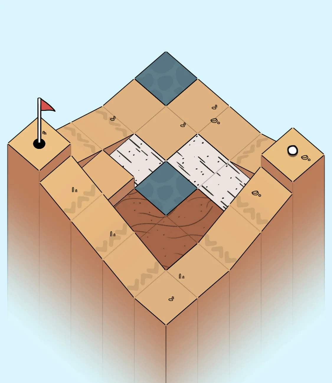
It’s easy to talk about the concrete elements of design. It’s fun to point out how the UX for the game lends itself to easy use and understanding. How the metaphors of golf work surprisingly well. But it’s easy to overlook the physicality of the work. The space looks like a playground. At once small and approachable and durable. I can imagine myself running around and bouncing off the walls. This sets a playful tone for my experience and means the game feels expansive in my mind.

The goal is to get the golf ball from your starting spot into the hole. Each round you have a number of cards to use to do so. Once your cards run out the round ends. This way, the number of cards represents a sort of "par" number. You succeed if you are under or at par.
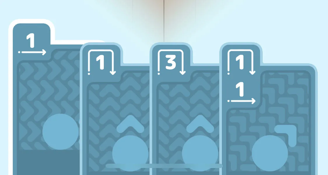
Each card represents a type of movement the ball can make, either straight through a tile, like a putt, or over a tile, like a chip shot. You are also given cards which represent a combination of the two, breaking the metaphor slightly but no less easy to understand. Each movement also has a number next two it, representing the number of spaces it will move. For example, a straight arrow with a 3 means you will move the ball 3 spaces across the terrain. When you pick a card, you can also pick one of four directions to “hit” the ball, so you have some choice in how the card gets utilized even after you pick it.
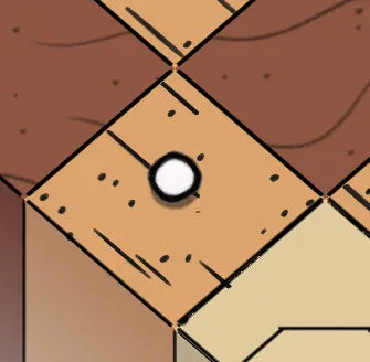
Each course also has different terrain which will change how the ball moves. There’s the basic grass terrain which the ball will move through at the expected clip, if you pick a 3 and putt across grass, the ball will move 3 spaces. Other terrain which will show up like sand, which stops the movement of the ball, ice which keeps the ball moving, or water which resets the ball to the last safe tile it touched. The combination of the tiles and the cards creates your “lay” for the puzzle determining how you will have to maneuver to shape the game.

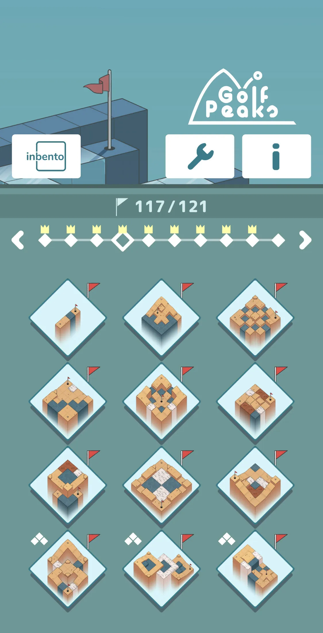
The grids are laid out like checkerboards, usually no more than 8x8 (I didn’t check every puzzle), but sometimes small, or strangely shaped. There might be spots missing that you have to avoid. There are also different levels of the terrain, so you might try to navigate the ball up or down the course, and that navigation might require moving up or down, and the terrain adjustment is sometimes smooth and sometimes not.
What’s in the Cards?
Cards in a golf game seems like a strange combination. The concept of “cards” as a game design tool is in vogue right now. It’s not hard to see why, cards are recognizable to a broad spectrum of people, regardless of how many (or few) games they play. Cards also come preloaded with concepts that are recognizable. We shuffle them, draw them into our hand, and discard them to name a few. Used well, a card can communicate a lot of information about how the player is supposed to behave.

At the same time, cards are often over utilized. It’s easy enough to make anything a card, especially digitally. Golf Peaks does not fall into this trap. The metaphor of the card works well to explain how the game functions and communicate its limits. Firstly, you are “dealt” a card of hands at the start of every puzzle. This is what you have to work with. Every time you play a card that “discards” that card for the puzzle, meaning you can’t use it again. And as I mentioned earlier, the cards themselves are discrete, each card represents a specific pattern you activate as a player. As you play cards to move your options become restricted.
Thinking about these as cards also help you with another metaphor in the UI, they come sorted. The potential cards (actions) you can play are ordered by their number (low to high, left to right) and then sorted by their respective types (putt, wedge, wedge + putt). This adds up to create a UI that is cohesive and easy to scan.
Exploration over Deduction
The other delightful part about Golf Peaks is that it’s a puzzle game about exploration instead of abstraction. A lot of puzzle games, like Sudoku, build towards an idea of understanding an underlying concept. While you are playing the game you're building a skill to read the game board to see solutions that are more complex and nuanced.
Golf Peaks doesn't ask this of me. It prefers exploration over deduction. Rather than penalizing a player for an incorrect move, it provides a helpful rewind and restart button. There are few cards (typically around 5 but no more than 10) which means trying out different combinations of movements is quick. This means I spend less energy trying to build a picture in my head and more time selecting moves and trying them out. It's less brain burning and more guess and check.

This means it's possible to "brute force" the game by trying every possible combination to find the solution. But that requires enough effort that it wouldn't be that much fun. It's the type of design problem I appreciate the authors didn't spend time trying to solve. If I want to brute force it, that's a personal choice I can make.
The game still manages to include moments of inversion, where I'll find myself using a card in a way I didn't expect or ignoring a tile I thought might be central to solving the puzzle. The game ends up mimicking a lot of what you do on the phone: tap, swipe, swipe, tap. As you work out a successful path through the maze. But unlike the mindless swiping you might do as you casually browse different websites, this swiping is thoughtful. You are trying to chart a path from one end to the other. The tapping and swiping feels meditative.
Final Thoughts
For $2.99 this game is worth your time. It's available for most platforms so you can probably find it on one where you're going to play it. The game is so gentle, it does a good job of explaining concepts like new tile pieces. This means it's approachable for players who don't spend much time around puzzle games. There is also enough content for seasoned puzzle solvers to enjoy the twists and turns.
The word lovely keeps coming back to mind when I think about Golf Peaks. The art style, the design of the puzzle, and the clever use of UI elements combines to create an experience that is delicate and refreshing. I recommend this to puzzle lovers and game players of all stripes.
The opinions in this post are expressly the views of the author and do not reflect the views of their employer(s) or any entities that they might otherwise be affiliated.