by Stuart Urback
Intro
Two things happened within quick succession for me last summer: Zach Gage released his new app Good Sudoku and I discovered the Miracle Sudoku YouTube clip which swept the internet. What I did not expect to happen was having my preconceptions about the relationship between puzzles, games, and user design altered.
I enjoy puzzle games quite a bit. There’s something about the discrete beginning and end that makes them approachable. There’s a definitive end that I’m aiming at, when the puzzle is filled out. At the same time, the creativity contained within these discrete spaces feels expansive and wondrous. 2020 was primed to be a sudoku year, and Cracking the Cryptic and Good Sudoku came into my life at just the right time. I can’t remember which came first: Good Sudoku or the Miracle Sudoku. In my mind Good Sudoku is where the story starts, so that’s where I’ll begin.
That’s Some Good Sudoku
My initial reaction to Good Sudoku was interest and elation. As one comentor on Twitter noted, “It feels like a Sudoku stim pack for my brain”. I played Good Sudoku non-stop for close to the month after it first released. I was insatiable. I felt like a door had unlocked in my brain about looking at Sudoku that made the game fun. The UI on Good Sudoku was snappy and easy to use, and the combination of hints and concept explainers. It felt like all of the best parts of modern video games and app design had been put into the app. There are certain phone apps and games where the UI feels so correct, that using it feels as simple as working with pen and paper. Good Sudoku felt that way for me.
The Design
There’s a few key pieces of UX that Good Sudoku does really well, that differentiate it from other games. The notation system for Good Sudoku is inspired, and it makes it easy to think about, see, and represent my thoughts on the game screen.
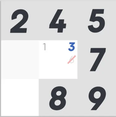
There are three main ways to note items in Good Sudoku: note a number in a box, bold the number, cross out the number. Each of these representations feels at once easy to understand, but also extends the metaphor of paper, so that using it is also easy. It makes working across the board fluid. Filling out the squares and seeing each of the potential spots is quick. It means you can get to the crunchy parts of the game, and hopefully solve them.
In addition to the notation system, there are three other default elements that add juice to the game. In the “good” and “arcade” modes, if you’ve filled in a square in a house (one of the nine primary squares that makes up a board) and that means another square has an available spot to fill with only 1 remaining notation, it will fill it in for you, and give a delightful little haptic tap as it does so. This feels like some combination of the cards falling down in solitaire, combined with the cha-ching! of a cash register that feels wonderful, while also cleaning up a lot of busy work.
If you don’t have any square selected and you tap on a number on the dial pad, it will light up the available zones, so you can make matches or eliminate spots with a sort of birds eye view.. Finally, when you tap into a square the default is to only let you click on the remaining accessible buttons based on what exists within the same row, column, and house. All of these add up to clearing a lot of drift away from the game to focus on the hard problems of solving the game.
In an interview on Eggplant: The Secret Life of Games, Zach Gage talks a lot about how Good Sudoku feels informed by recent roguelike games. It’s programmatically designed based on mathematical concepts. The puzzles are picked based on programmatic difficulty ratings. Thereis a set of principles that you can learn that will improve your ability to succeed at the game. What Good Sudoku does so excellently is take core design principles to the notation pieces of Sudoku and port them over to the digital format. It really is just way better than the million other Sudoku apps you can find on iOS.
The Pros and Cons of Instrumentalization
Good Sudoku has the crucial realization that the UX of sudoku defines the user’s experience. In fact, the different game modes even speak to this. The dailies, three separate daily puzzles, are defined by their different notation and feedback mechanisms, even though they’re all roughly the same difficulty level. Arcade mode uses hearts, and will immediately penalize a player for failing to place the right number. Good mode will not penalize a player for an incorrect placement, giving the player more control. Classic mode, which strips away all of the notation, highlighting, and haptics, mimics playing on paper.
The speaks to feedback being a core challenge that newer players have with puzzles: feedback doesn’t come until the end of the game. Good Sudoku introduces view modes (seeing what rows and columns have eliminated from numbers), and feedback mechanisms that tells players whether or not they’re on the right path. Getting started with Good Sudoku is a breeze. It alleviated a lot of the principle reasons I struggled getting into sudoku from the start. But after I internalized the techniques, I hit a wall. Without warning, the game got less engaging. I found myself going back to it less and less, usually only for the dailies. The game dragged.
I noticed I cared more and more about the speed I executed moves and I felt increasingly limited by my inability to find Y-wings and X-wings. The games somehow felt boring because I would quickly solve the first half a puzzle and then insurmountable when I couldn’t get any further. So I stopped. The conclusion I came to is that Good Sudoku ends up as an exercise in pattern matching (searching for the right tool and deploying it), than the feeling of experimentation and discovery I appreciate about puzzles. I learned all the core concepts but I didn’t feel like I deployed them in interesting ways, more that I was hunting and pecking for the “right” thing to do.
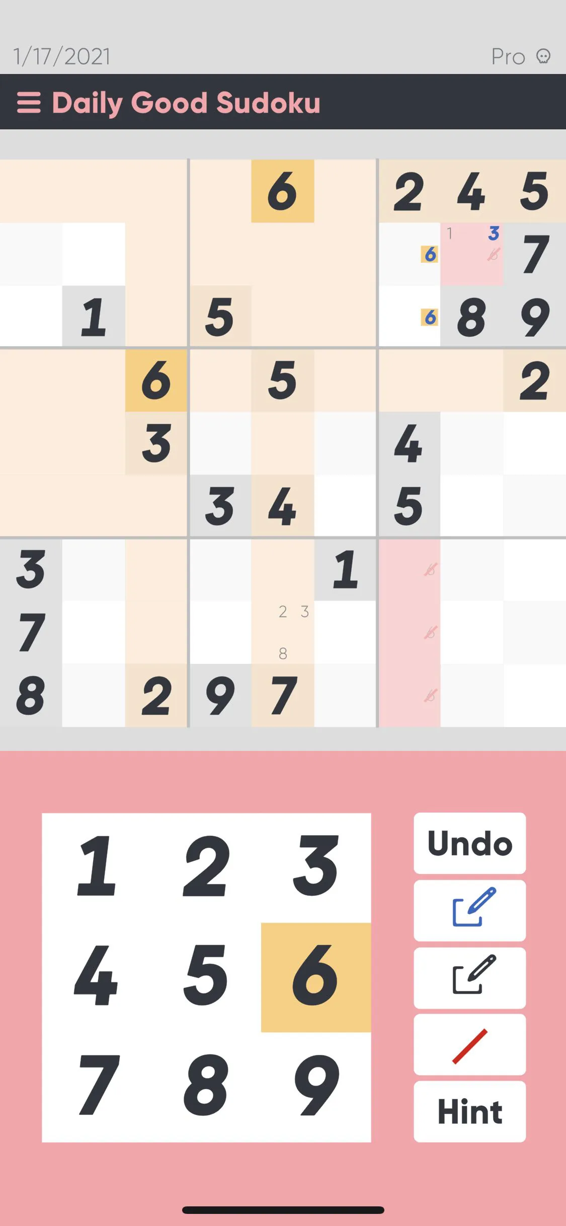
It’s important to note, here, that there are a number of settings that can be customized and turned off, here. It’s possible to turn every game into a “Classic” edition but I’m analyzing the game from the default perspective as I think it’s the most productive to discuss design intent.
This brings me back to the initial reaction to the concept of Good Sudoku as a “stim pack for your brain”, with the benefits and challenges that come with it. It reminds me a lot of an article in The Atlantic about how one of the principle challenges of AI is that it clears up a lot of low hanging fruit which only leaves the stressful elements left for humans to deal with. That’s how Good Sudoku feels to me. It lets me fly further and faster at Sudoku than I could otherwise. But it also makes me choose between flying fast or sipping my coffee. Some of the fun of puzzle games is actually the ritual of filling out the boxes and making the little marks.
An example of this is in the display system which will highlight available boxes when you select a number on the dial pad. This is helpful when setting up the puzzle, making it clear where certain numbers block out rows and columns. This turns the start of most games into highlighting each number, blocking out the rows and columns where they couldn’t exist, and then starting the game from there. Which got me thinking about automation: if the computer is showing me this, why couldn’t it just do this for me too? Extending this question further, which my brain has a tendency to do too much, makes me question just how much of this experience is being driven by my own choices, and just how much is me playing along with the constraints of what the machine allows me to do.
That’s probably part of the reason I enjoy the Classic experience so much more. Without any of the helpers, it’s not just that there’s no machine assist, it’s that I am the machine making the operations, and those set of operations are fun, even if they are menial. Some of the fun of sudoku is the human limitations. This is a common theme of video games generally, the tension between authored experiences and human fallibility. A lot of what constitutes UX is giving players nudges to see the thing they need to see so they can move on to the next level.
This isn't to say this makes Good Sudoku worse, or that I don't think you should play the game. It’s too easy (and not my intent) to extend my argument into a place where any approachability or accessibility features would "destroy" the "intent" of the puzzle. Far from it. Without Good Sudoku I would not have even gotten back into sudoku puzzle solving at all. It’s more the elemental challenge of how can you tune these experience to be supportive without making the success a player achieves a fiction. It’s also the tension of cleaning up enough low hanging fruit so that players can understand the core concept of the puzzle but while also leaving enough potentially obvious answers that players can continue to feel successful along the way. I appreciate where Good Sudoku lands, but it makes it harder to become a long term game for me.
Let’s Get Cracking
If Good Sudoku rekindled my interest in sudoku and puzzles, Cracking the Cryptic launched it into near earth orbit. Cracking the Cryptic is a YouTube channel, Patreon, Discord, and series of apps/games based around puzzle solving and especially math games like Sudoku. It caught on May 2020 when the Miracle Sudoku clip blew up over the internet. The Cracking the Cryptic releases a YouTube clip once or twice a day where you get to watch a professional puzzle solver solve a mind bending challenge. Learning about the patterns that other people use to solve problems invigorates me. And the hosts on the channel are so delighted and enthusiastic about the design of the puzzles brings a Great British Bake-off sort of feel to it.
If Good Sudoku takes a lot of modern commercial game design concepts and applies them to the puzzle, Cracking the Cryptic appreciates the design concepts of the rules of sudoku. How “setters” can use rules and clever number placement to give the smallest possible number of starting clues to unfold an entire puzzle. There are also a number of iOS/Android/PC games that take different twists on the sudoku format and pull them into interactive forms. These include Chess Sudoku, which adds chess moves to sudoku blocking; killer sudoku, which adds special boxes that restrict numbers based on sum, among others.
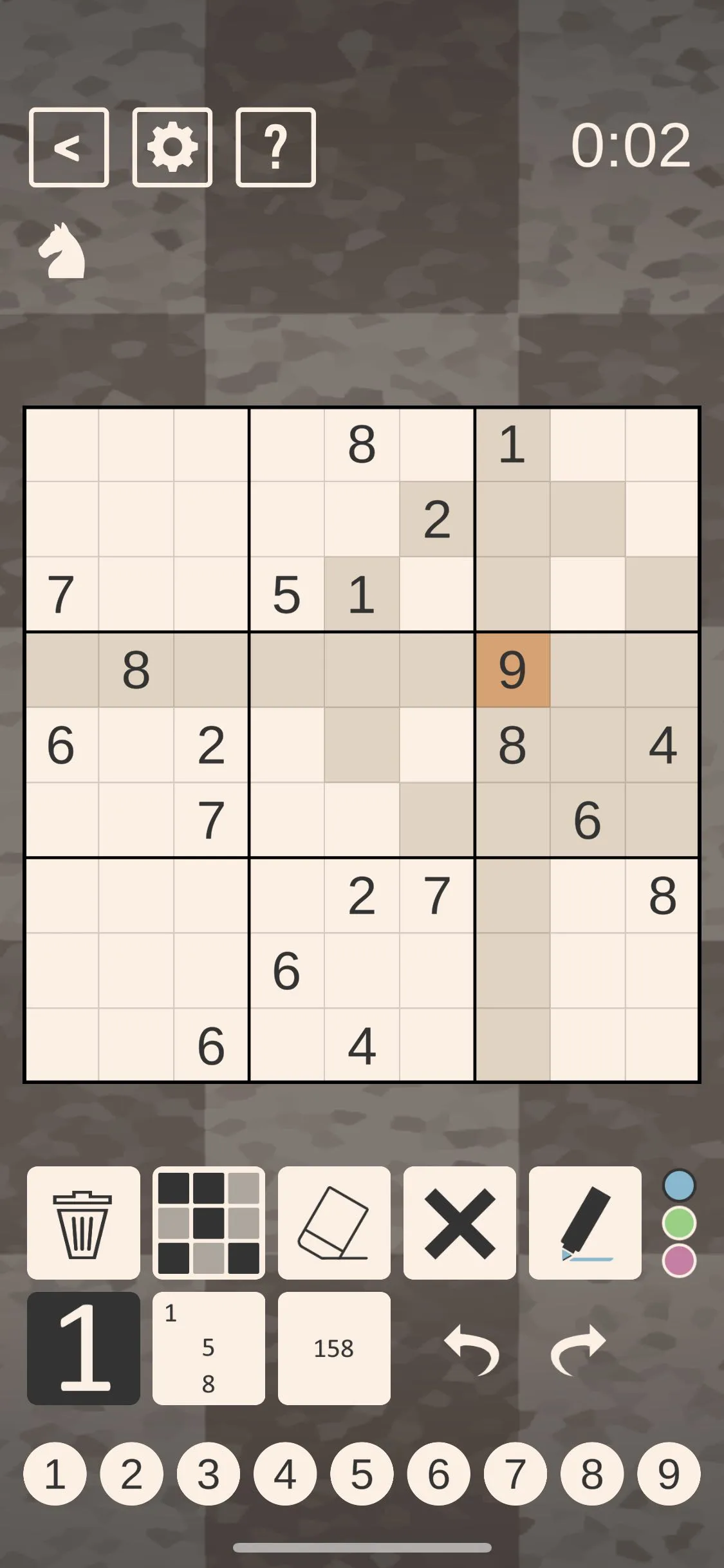
Comparing the applications to Good Sudoku is somewhat unfair. From a pure UX perspective, Cracking the Cryptic is much less friendly than Good Sudoku. There’s the base challenge that the targets for selecting numbers are small and in a row, so it’s easy to hit the wrong number accidentally. The two numeric notation systems aren’t well explained and don’t play well with one another. I figured out the best way to use them by watching the YouTube channel.
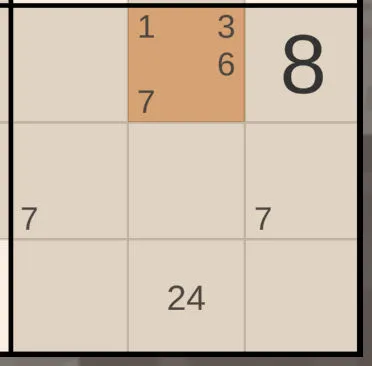
The hint system feels like it’s from a decade ago, compared to Good Sudoku’s. Ask for a hint in Chess Sudoku (the game I’m playing at the moment) and a text box will pop up with a series of potential explanations. This might be helpful at the start of the game but will become unusable if you’ve taken a different path through the system. The hint system in Good Sudoku uses machine learning to figure out where you’re at, your path to the solution, and then gives you a single technique (along with an explainer) to keep you moving down the puzzle. The hint system in Good Sudoku is absolute magic.
There are also some highlighting tweaks that I appreciate. For one, when I select a number, it will highlight the associated notations in boxes for me. This helps me see the board when it gets filled up without making it blindingly obvious where a row or column elimination might be, so I still get to feel smart when I make a simple discovery. It also allows you to highlight multiple boxes and then shows you the set of boxes that are covered up by both. This is helpful for seeing combinations that might be unlocked at harder parts in the game.
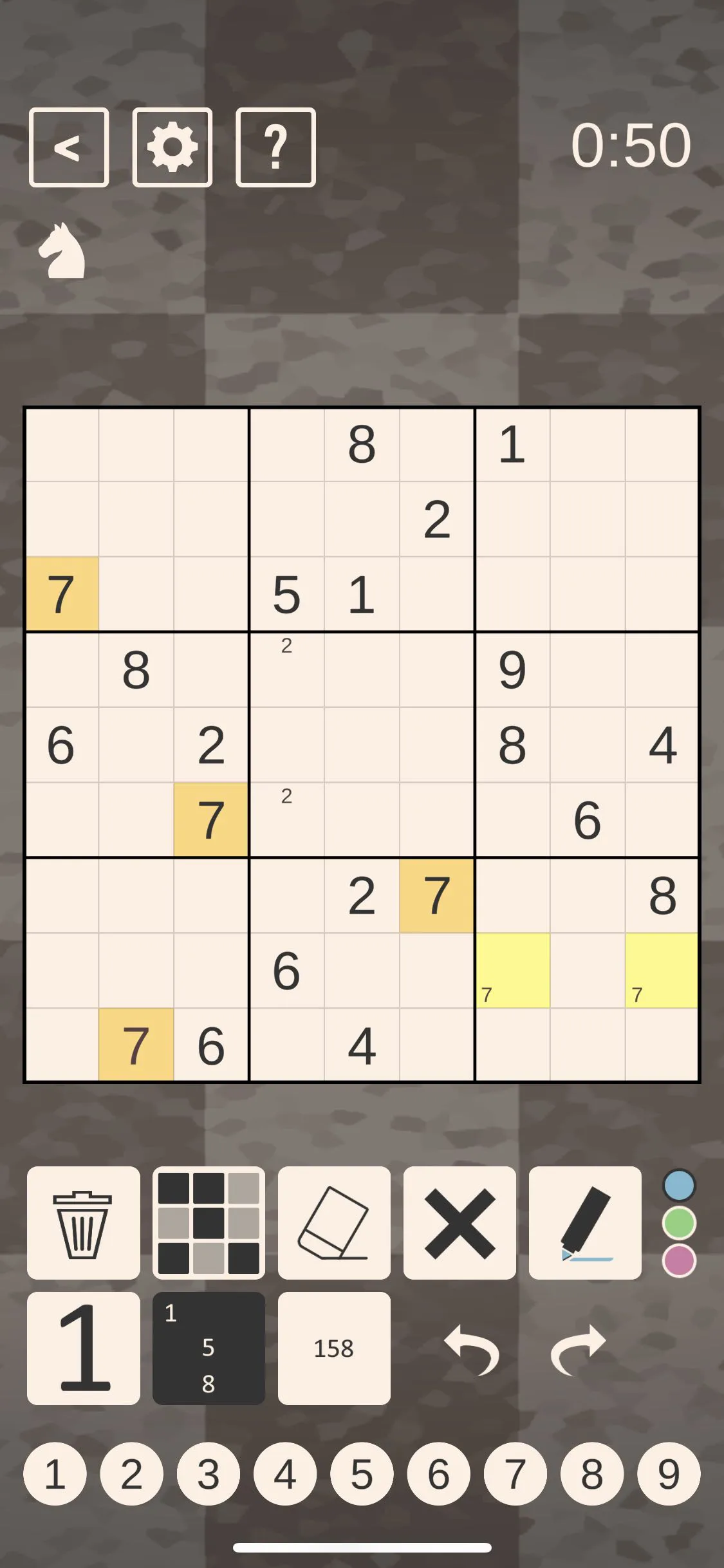
For all the gaps and inconsistencies , I’ve spent more time playing Chess Sudoku than I’ve spent playing Good Sudoku in the last month. The counterpoint to the challenges with Chess Sudoku’s notation system is that because it isn’t opinionated it feels more like a set of coloring tools that I can use however I want. This is inefficient for a beginner, who likely wants to be told the most efficient way to use notations, but is somewhat freeing where I’m at, when I want to experiment with how I think about the game. Part of the fun of these apps is in the “playing along”, or getting the opportunity to use similar techniques that you see the hosts of Cracking the Cryptic play in the games that you play. Playing with the associated apps feels fun because of their connection to the YouTube channel, and I’m not sure I would enjoy them as much without it.
The Strength of Interpretation
It would be easy enough to turn this critique into the four or five things that I think both apps do well that I wish I could mash together into a super app, but I don’t think that’s a particularly helpful perspective. The beauty of playing with each is in seeing how different UI implementations can lead to such divergent play experiences.
For example, Zach Gage was very public about the fact that he struggled with sudoku and found most of the app implementations hard to understand. The app he designed is clearly framed around this perspective. It cares a lot about getting me to understand the core of the game and what to think about when I’m looking at it. There’s a scoring system that’s clearly there to reinforce the good habits I’m building, and the daily games are structured very similarly to NYT Crossword mashed up with a roguelike. Each day of the week the challenge of the game ramps up until Sunday when it feels nearly impossible. The game also ranks me. It’s built a lot around trying to build enjoyment and a small community around figuring out what the exciting element of sudoku is.
The Cracking the Cryptic apps pre-supposes excitement about sudoku. I think if I tried to start with these apps I would’ve bounced off and not picked them up again. The apps are more about a play on a specific variant of the game and the interesting combinations when thinking about it. In that light, the plethora of notation devices feels like a way to explore and experiment on the sudoku board however you like, rather than guide you towards a solution.
For my journey into the world of sudoku, it was the combination of both apps, and the YouTube channel that expanded how I think about framing and solving these mathematical puzzles. I don’t think just watching the Cracking the Cryptic channel would have got me there. A lot of the concepts I didn’t grasp, and the extra games didn’t feel like much fun when I didn’t have the full context. Good Sudoku feels like a focused version of the game. Playing and comparing each of them expanded my viewpoint as a designer and a problem solver.
I played each of them on iOS:
Good Sudoku: https://apps.apple.com/us/app/good-sudoku-by-zach-gage/id1489118195
Chess Sudoku: https://apps.apple.com/us/app/chess-sudoku/id1500654482
The opinions in this post are expressly the views of the author and do not reflect the views of their employer(s) or any entities that they might otherwise be affiliated.